Sooner or later every brand has to answer a small question that feels big: serif or sans serif? It comes up when you design a logo, a menu, a website or a sign, and the answer changes how the whole brand feels. This guide explains the difference in plain words, what each style tends to say, and how to choose without guessing.
What is the difference?
A serif is a small stroke added to the end of a letter, like a tiny foot or a flag. A typeface with these strokes is called a serif typeface. “Sans” comes from the French word for “without”, so a sans serif typeface is one without those small strokes, with simple, clean endings on every letter.
That is the whole technical difference. What matters for a brand is what that difference does to the feel of the words.
What a serif says
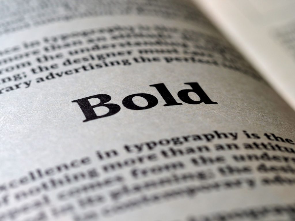
Serif typefaces have a long history in printed books and newspapers, so they tend to feel traditional, established and human. Many also have strokes that vary between thick and thin, which gives a crafted, elegant look. In hospitality, serifs often suit fine dining, heritage hotels, wine, spa and boutique villa brands, anywhere the message is care, craft and a certain calm.
The risk is that a serif can feel formal or old-fashioned if the rest of the brand does not support it, and very fine details can disappear at small sizes or on a rough surface.
What a sans serif says
Sans serif typefaces have simple, even strokes. They tend to feel modern, direct and friendly, and they are usually easy to read on screens and at a distance. That is why so many beach clubs, cafes, street food concepts, apps and tech companies use them.
The risk is the opposite one: a plain sans serif used without any other character can look generic, because so many businesses choose it. The shapes of the letters, the spacing and the weight still matter a great deal.
Is one easier to read?
It is a popular belief that serifs are easier to read in print and sans serifs are easier on screens. In practice, the quality of the individual typeface, the size, the spacing between lines and the contrast with the background matter more than the category. Modern screens show fine detail well, and many sans serif and serif faces work well in both places. The honest advice is to test the actual typeface, at the actual size, in the actual place it will be used.
How to choose for your business
- Start with the personality, not the font. Write three words for how the business should feel, for example warm, calm and refined, or bold, relaxed and young. Then look for a typeface that matches those words.
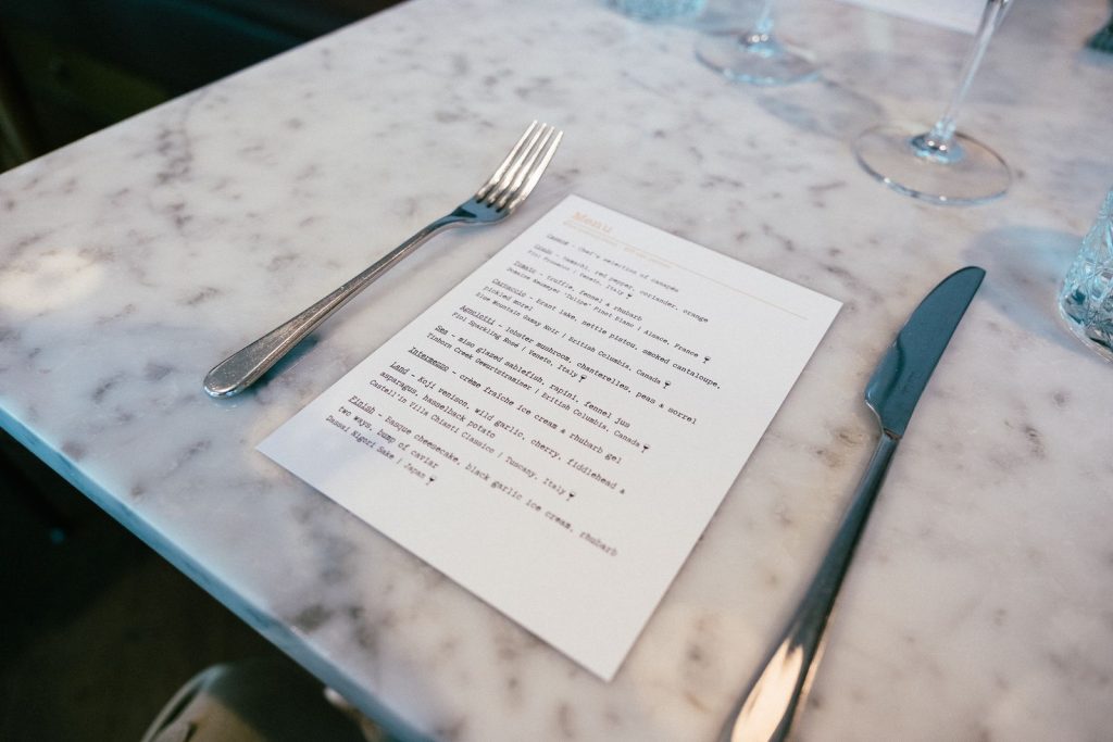
- Look at where the letters will live. A name on a sign seen from a road needs strong, open shapes. A paragraph on a menu needs clear letters that stay readable in dim light. A website needs a typeface that loads quickly and looks sharp on a phone.
- Look at your neighbours. If every restaurant on the street uses a thin sans serif, a confident serif can help you stand out, as long as it still fits you.
- Do not follow a trend. A typeface that is everywhere this year may look dated in two. Repainting a sign costs far more than reprinting a menu.
Pairing a serif with a sans serif
You do not have to choose one. Many strong brands use a serif and a sans serif together, each with a clear job. A common approach is a typeface with character for the name and headings, and a quiet, readable one for descriptions, prices and small print. The pairing can go either way: a serif heading with a sans serif body feels classic and clear, and a sans serif heading with a serif body feels editorial and warm.
Keep it simple. Two typefaces is usually enough, and a single family with several weights can also do the whole job. More than that and the brand starts to look like a collection instead of a system.

Mistakes we see often
- Choosing a typeface because it looks good in the logo, then discovering it is hard to read in a paragraph.
- Using very thin weights on dark backgrounds or on textured paper.
- Mixing two typefaces that are almost, but not quite, alike. If they are going to differ, let them differ clearly.
- Skipping the licence. Fonts are software, and a licence for print may not cover a website, an app or sign production. Check the terms for every place you plan to use it.
- Never writing the rules down. Without a short note on which font is used where, every new designer or printer will guess.
The font is part of the brand, not the whole brand
A typeface is one tool in a brand, alongside colour, photography, tone of voice and, above all, how guests are treated. It is the same idea as the difference between a logo and a brand: the letters carry the personality, but the experience is what people remember. If you are choosing fonts for a new venue or refreshing an existing one, it helps to decide them together with the rest of the identity. You can read more about how we approach this in our branding and logo design work.
FAQ
Is serif or sans serif better for a logo?
Neither is better. A serif suggests tradition, craft and elegance. A sans serif suggests clarity, modernity and ease. Choose the one that matches the personality of the business, then check that it stays clear at very small and very large sizes.
Which is more modern, serif or sans serif?
Sans serif is more often associated with modern brands, but there are many contemporary serif typefaces, and many old sans serif ones. The date of the design matters less than how the typeface is used.
Can I use serif and sans serif together?
Yes, and it is very common. Give each a clear role, such as headings and body text, and keep to two typefaces so the result stays consistent.
Which is better for a restaurant menu?
It depends on the style of the restaurant and the lighting. What matters most is that the descriptions and prices are easy to read at a normal seating distance, so test a printed sample in the room before you commit.
Are free fonts good enough for a brand?
Often yes. Many open-licence fonts allow commercial use. Read the licence for each one, and remember that a font used by many businesses will make your brand look less distinct.
Sources and further reading
The advice in this article reflects common design practice. For the point about font licences, see:
- Google Fonts Knowledge, Licensing. It explains that every font, including a free one, comes with a licence, and that the licence sets what you may do with it. This article is general information, not legal advice.