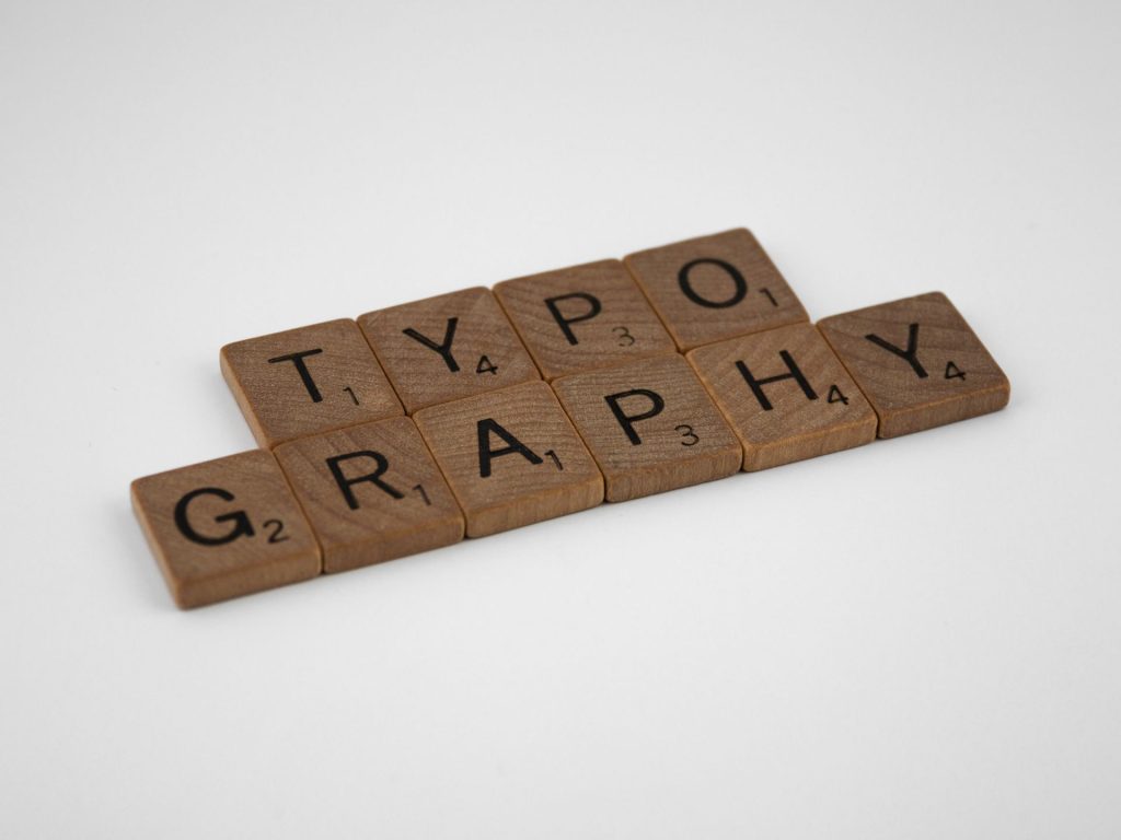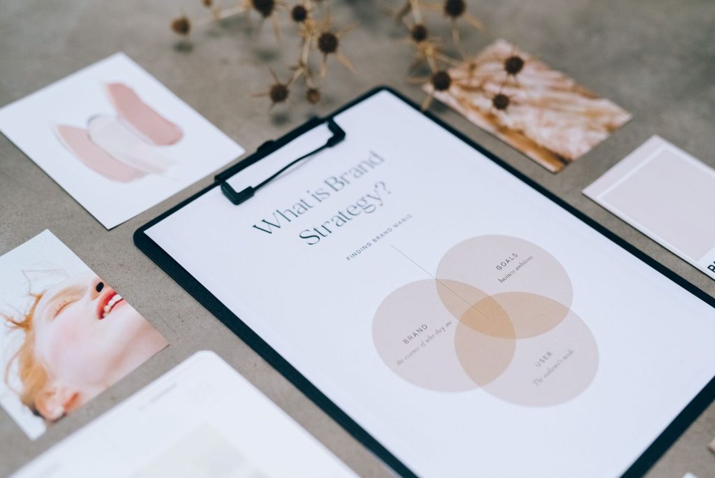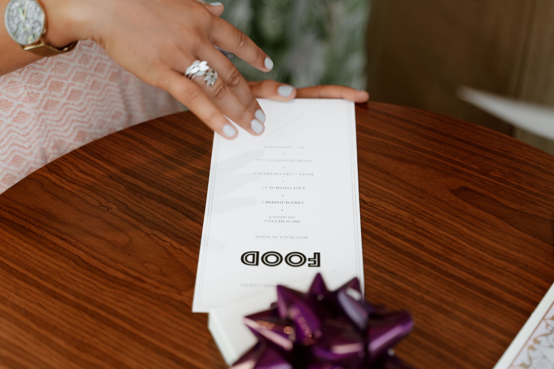
The typeface is the voice of a restaurant before anyone reads a single word of the menu. It also has to work in dim light, at a distance and on a phone screen. Here is how we think about choosing one, from the practical points to the details that are easy to miss.
Start with where the type will live
List every place the letters will appear before you look at a single font: the menu, the sign above the door, the bill, the website, social media, uniforms, packaging. A typeface that looks beautiful as a logo can fail as a paragraph of dish descriptions. Knowing the places in advance tells you how many weights and styles you need.
Readability comes first
A menu is read quickly, often in low light, by guests of all ages. A few things help:
- Choose clear letterforms with open shapes, so that a, e, c and s do not close up at small sizes.
- Use a comfortable size and enough space between lines. Cramped text is tiring to read.
- Avoid very thin weights for body text, especially on a dark background or a textured paper.
- Check how numerals look. Prices must be easy to read at a glance.
Signs follow the same logic at a larger scale. Letters need to be read from across the street, in sun, rain and darkness, so generous spacing and strong shapes matter more than subtle detail.
Pair two typefaces, not four
Most restaurants only need two: one with character for headings and the name, and one quiet, readable face for descriptions and prices. A single typeface family with several weights can also do the whole job. More than that, and the page starts to look like a collection rather than a brand.
Script and decorative faces work best in small doses, for a name or a short heading. They are hard to read in long text and should not be used for prices or ingredients.
Match the type to the room, not to a trend
The typeface should feel like the place. A relaxed beach restaurant, a fine dining room and a street food counter each speak differently. A trendy font that suits this year’s menus can look dated in two years, and repainting a sign is far more costly than reprinting a menu. If you are unsure, choose the simpler option and let colour, photography and materials carry the personality.
Check the licence before you fall in love
Fonts are software, and each one comes with a licence. The licence for print may not cover use on a website, in an app, or in embroidery and signage production. Many open-licence typefaces, including those on Google Fonts, allow commercial use, but you should still read the terms for each one. For paid fonts, confirm that the licence covers every place you plan to use it, including the printer or signage maker who will need the font files.
Test it before you commit
- Print the menu at real size and read it in the lighting of the actual room.
- Look at the sign mock-up from the distance a guest will see it.
- Open the website and the menu on a phone.
- Check that the typeface includes every character you need, including currency symbols and any accents used in dish names.
FAQ
Can I use a free font for a restaurant brand?
Often yes, many open-licence fonts allow commercial use. Read the licence for each font, and remember that a font used by many other businesses will make your brand less distinct.
How many fonts should a menu use?
Two is a good rule: one for headings and one for body text. A single family with several weights is also fine.
Should the logo font match the menu font?
It does not have to be identical, but they should clearly belong together. Many brands use the logo typeface for headings only, and a simpler companion face for everything else.
What size should menu text be?
There is no single number, because it depends on the typeface and the lighting. Test a printed sample in the room and ask someone who does not know the menu to read it from a normal seating distance.
Sources and further reading
The advice in this article reflects common design practice. For the point about font licences, see:
- Google Fonts Knowledge, Licensing. It explains that every font, including a free one, comes with a licence, and that the licence sets what you may do with it. This article is general information, not legal advice.