
Challenge
BOSS BABI makes premium pork creations from Bali, slow-roasted porchetta and Balinese urutan sausage, prepared to be kept frozen and enjoyed at home. The category is crowded and visually noisy: rows of similar packs, cold cabinet lighting and only seconds to catch the eye. The brand needed an identity that was unmistakably Balinese without looking like a souvenir, that read instantly from a distance, and that gave customers a reason to trust the taste before they had tried it.
Strategy
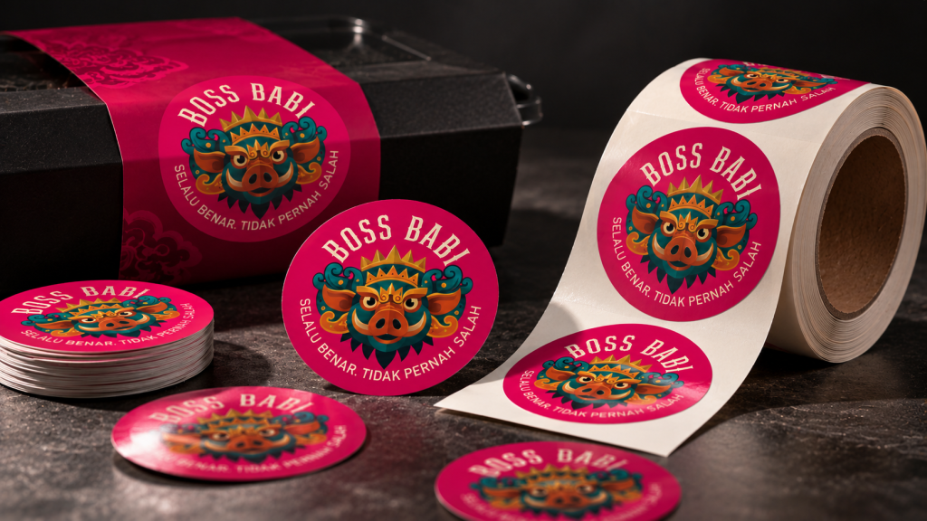
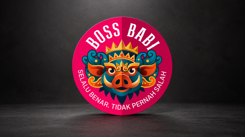
We built the brand on two ideas. First, origin: the Barong, Bali's guardian figure, became the foundation of the logo, reinterpreted as a pig's face framed by the Barong's crown and ornament. It gives BOSS BABI a face that is rooted, bold and proudly local, with a touch of humour that fits the name.
Second, confidence. The company's character is simple: it never gets it wrong. The tagline Selalu Benar. Tidak Pernah Salah. was therefore made a permanent part of the identity rather than a campaign line. It sits beneath the logo on every pack, every sign, every shirt and every post, so the promise of food that is always right and always good is repeated until it is remembered.
Colour was treated as the first job of the design. A saturated magenta, paired with warm cream and black, was chosen for maximum contrast against the browns and golds of roast pork and the cold light of a freezer cabinet, so BOSS BABI is the pack you see first. The Barong mark carries the traditional Balinese palette of blue, orange and yellow, keeping the heritage colours in the symbol while the brand colour does the work of standing out.
Execution
- Logo and brand identity: a Barong-based pig mark drawn as a clean, modern symbol that holds up from a chest print to a kiosk fascia; a locked logo system with the tagline; the magenta, cream and black palette; and bold condensed typography for product names.
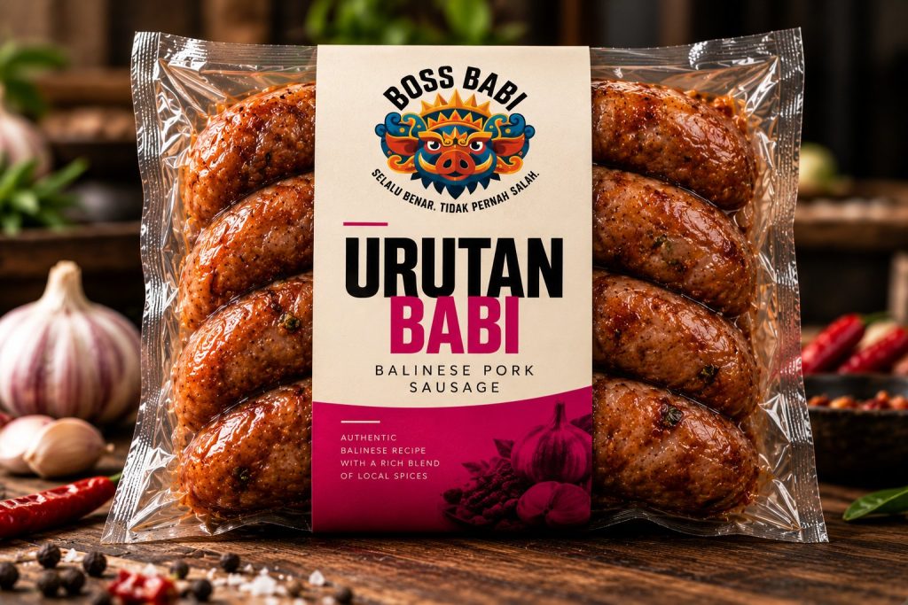
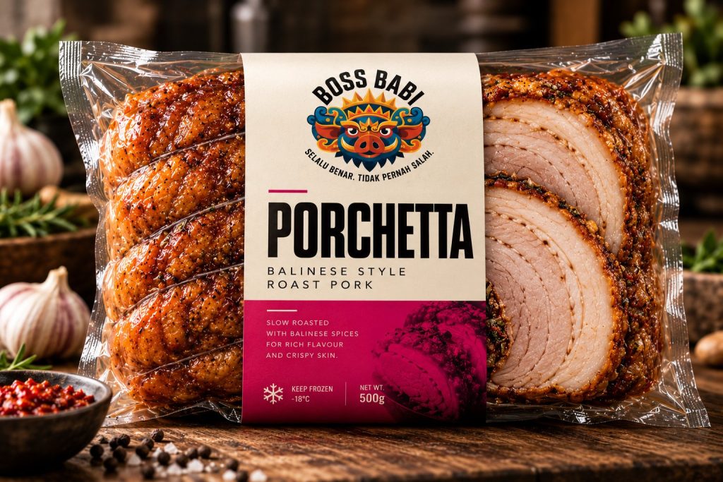
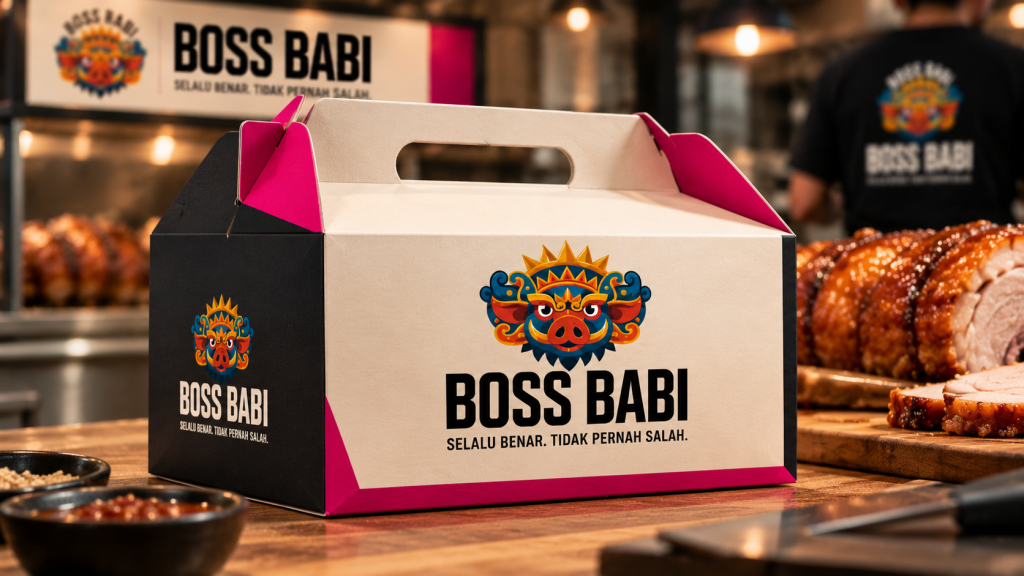
- Packaging: front-of-pack sleeves for Porchetta and Urutan Babi, led by the logo and a large product name, with product descriptors, keep-frozen and net-weight information, and a magenta band carrying a tonal product illustration.
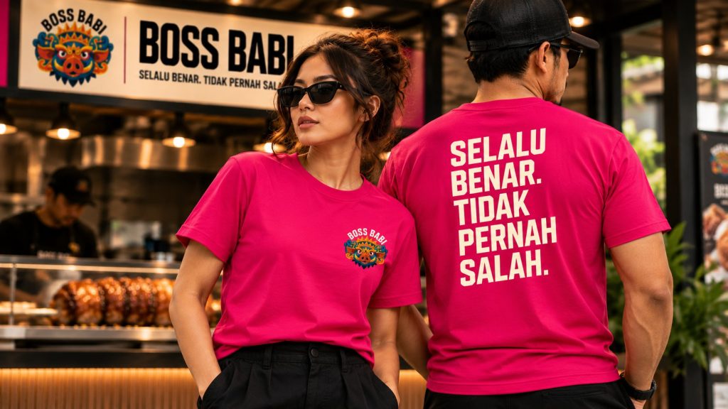
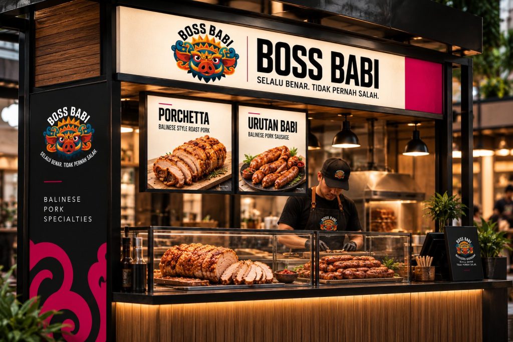
- Kiosk and signage: fascia, menu lightboxes, side panel and counter branding with the Barong ornament as a large-scale pattern.
- Merchandise and uniform: staff tees, caps and aprons carrying the logo and tagline.
- Social media: feed templates, product photography direction and content for Instagram and TikTok, keeping the same colour, mark and tagline across every post.